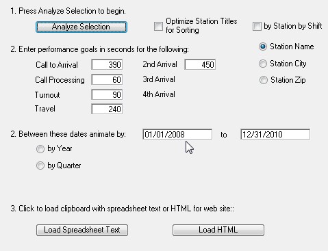
Not all analysis gets published to paper. Frequently it's valuable to combine many different measurements into a single web posting allowing users to select the performance measurement they want to see. When you want to this type of "dashboarding" press either the "Web Motion Charts" or the "Web Timelines" button.
![]()
Begin by pressing the "Web Motion Charts" button. The select the options and enter the parameters you want. Then press the "Load Spreadsheet Text" button.
At this point you need to sign-up for a free Google email account. One of the advantages of having a Google email account is the ability to access Google Documents. Press the "Documents" link. Now press "New" and then select the "Spreadsheet" application.
Simply paste the spreadsheet text you created in NFIRS 5 Alive into cell "A1" of Google's spreadsheet application.
Now under the "Insert" menu select "Gadget". Scroll down until you see the "Motion Chart" gadget. Select this gadget and follow the instructions for creating and publishing your "Motion Chart". Here's an example of a motion chart illustrating incident activity by station by shift animated by performance from Call to Arrival at 420 seconds. You can animate the chart by Quarter by pressing the play button in the lower left corner.
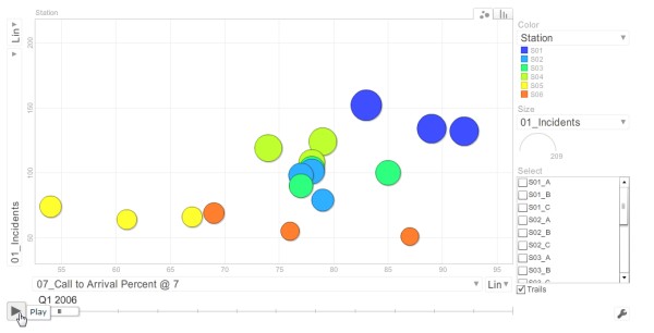
Spend some time experimenting with the settings on this chart. If you press the bar chart tab in the upper right corner you will convert the graph from dots to bar graphs.
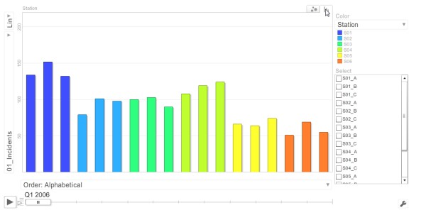
Both the dots and the bar graphs support animation. Just click on the Play button in the lower left portion of the screen.
Dashboarding may show data over several years, but it's just as effective illustrating data over a period of days. This feature can keep you up-to-date on daily performance.