When you click on a report generator button you will not see any formats listed. You will see several buttons representing NFIRS 5 Alive tables. If you click on a table button you will then see a list of report formats for that table. Here we've pressed the "Graph" report generator button and the "Incidents" button so we are viewing a list of graph reports in Incidents.
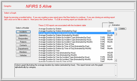
If you click on a report title you will see a description of the report in the scrolling field below. This same report interface is used for each of the seven report generators.
The title of the report is listed on the left. The "Series" column indicates reports that are broken down by "TYPE" (fire, EMS or other), "TIME" (time of day in six hour blocks) or "QTR" (three month quarterly).
Animation provides the 4th dimension of NFIRS 5 Alive graph reports. Reports can be animated by hour of the day (24), day of the week (7) or by month (12). Double-click on the report to view it.
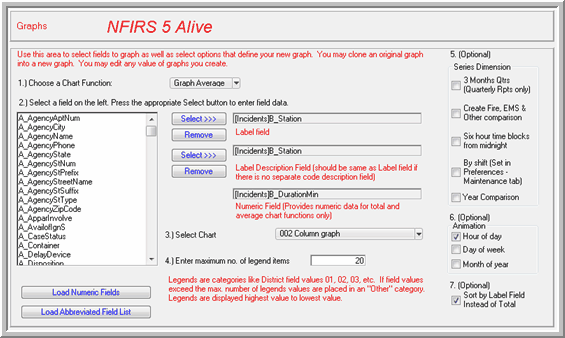
Here's how to setup a new graph report.
1. Select a chart function. You can have your graph produce counts, averages or totals of numeric fields.
2. Select the field you wish to analyze by clicking once on the field title. Notice the letter in front of the field title. The letter is used in the Incidents table to identify the module. For example, "B" for Basic, "A" for Arson, "F" is for Fire, "S" is for Structure Fire, "HM" for Hazmat, etc. Click once on the field you wish to analyze. Now press the "Select" button to automatically copy the field over into the field areas on the right. Notice there are two fields. If you have a field like Census Tract the same field title is used in both fields. But if
you have a field that has a description associated with it, the description field should be identified in the second field. In Incidents this is generally handled automatically. In other modules you may need to select two fields from the list, the coded field first, then the description field. Below the list of fields you will see two buttons. If you have not selected a "count" NFIRS 5 Alive needs to know the field to look to for a value. You can load a list of numeric fields by pressing the "Load Numeric Fields" button. Use the "Select" button to automatically copy over a numeric field into the Numeric Field area. The "Load Abbreviated Field List" button allows you to narrow down the list of displayed fields to those you have selected for searching. This can be a real time saver as your focus on key fields only.
3. Once the fields have been selected choose a Chart. You have several choices. It's best to experiment a bit here. It's a matter of presentation style. Choose the chart that best displays the data you have selected.
4. Enter the maximum number of legends in the chart. Let say, for example, we want our column chart to display Incident Types. Well, there could easily be 70 different incident types over the course of a year. That would be too many columns to display accurately. So legends allows you to view the top 20 types by entering 20 in the legends field. The remaining incident types, those with the fewest runs, will be grouped in an "Other" category and displayed in a single column on the graph. Note: When dealing with a large number of potential columns consider using a numeric array. There is no limit to the number of categories supported by a numeric array.
5. Optionally, select a 3rd dimension to your chart by breaking down counts, totals or averages by quarterly month, incident type or hour of the day. If you have selected a pie chart you should not select this option because pie charts do not support a 3rd dimension of display.
6. Optionally, select a 4th dimension by animating your chart. All chart styles, including the pie chart, can be animated by hour of the day, day of the week or month of the year.
7. The "Sort by Label Field Instead of Total" check box allows you to select the order of the graph elements. If you check this box your graph elements will be ordered by the first field you selected, for example by the census tract number. If you do not select this check box the order will be in the order of the largest count by type. This is important to understand. If, for example, we are dealing with averages here, it's not the highest average that's used for this sort, it's the highest number of incidents that determines the order. This
is done to organize the display so the "Other" category is always populated by those elements experiencing the fewest number of incidents.
8. Enter a name for the report. It is recommended you press the "Default" button to have NFIRS 5 Alive create the name. Check the name carefully and correct any errors or add any missing spaces.
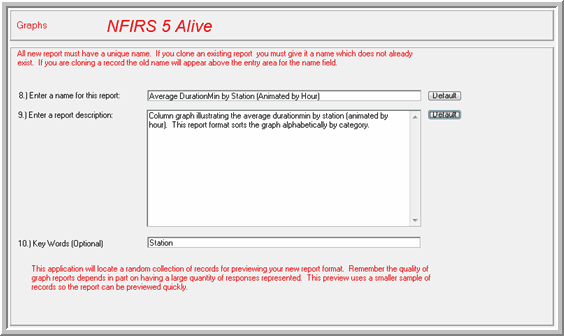
9. NFIRS 5 Alive can also automatically create a report description by pressing the "Default" button.
10. Add any Key Words you wish. You can use these key words to help you search for report formats.
To see a preview of your report press the "Preview" button. It's recommended you allow NFIRS 5 Alive to select a small number of random records to test your new report format. Once your test report is processed it will be displayed.
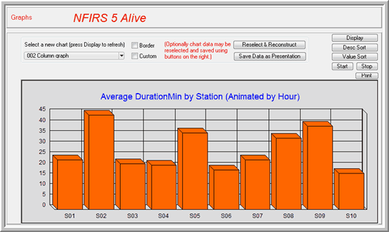
You now have the option of changing the graph type, adding a border or trying a custom style. You can reselect the incidents to include in your report and reconstruct the graph to reflect the different set of incidents. You can also press a button to save the chart you just created as a Presentation.
The remaining buttons allow you to change the sort and to test the animation quality of the report. You can even send the report directly to the printer.
Make sure you press "Accept" to save your report or press "Cancel" to cancel the changes you have made.
NOTE: When you return to the list of graph reports it's a good idea to reselect the report table. This will make sure any changes you have saved will be reflected in an updated report