NFIRS 5 Alive KML files contain a lot of information. After opening the KML file in Google Earth make sure you spend the time exploring your map and picking-out trends.
Google Earth provides tools to zoom and tilt the map image. Hold down the shift key while pressing the left mouse button to tilt the map. Try different angles. Zoom in and out using the tools in the upper right corner of the Google Earth display.
If any maps seem overly complex check-out the left side of Google Earth. There you will see a series of folders that can be expanded or contracted. Each folder can be turned on and off. Within each folder individual data elements may also be turned on and off. Use the folders and element "switches" to enhance the display of data as you zoom into different levels on the map.
If you are viewing an animated map make sure you click on the timeline enable button in that appears in the upper-right area of the map. On the left side of the time-line you can click a button that allows you to slow the animation speed and set the time zone for the animation.
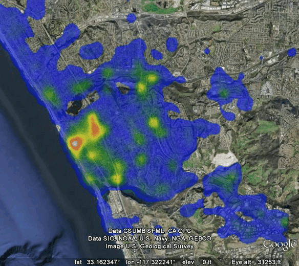
Heat Map Example
Heat maps display call densities by color. Here we see the highest call density in white. Higher call densities in red and yellow and lower call densities in blue.
The power of the heat map lies in record selection. You can view structure fires, vehicle accidents, incidents where the response time was greater than 8-minutes, etc. Heat mapping can be a great visual representation of any incident distribution you select.
The coordinates for the map below were exported from NFIRS 5 Alive and imported into Heat Map Studio (a product of slimApps) and displayed in Google Earth (a product of Google, Inc.).
