NFIRS 5 Alive performs very sophisticated GIS calculations, but it doesn't contain a single map. What it lacks in maps it makes-up for with it's connections. Here's the story.
Before broadband Internet most geographic resources had to be installed locally. If you wanted to see a map, the map had to reside on a local PC or server. Now broadband connections allow map images and satellite views to reside in a remote location. By properly formatting your geocoded data you can utilize "web services" to call-up sophisticated maps and see your data in detailed aerial views without having the maps installed on your PC.
The emerging standard for viewing geographic data over the web is called KML, that's the abbreviation for Keyhole Markup Language. KML is an XML variant designed for the communication geographic data.
KML was introduced by Google, Inc. in their original mapping product "Keyhole Earth Viewer" released in 2004. That product quickly evolved into Google Earth and Google Earth Pro. Google Earth and Google Earth Pro are products of Google, Inc.
Other products that utilize KML include:
ArcGIS Explorer, a product of ESRI, Inc.
Microsoft Virtual Earth, a product of Microsoft, Inc.
World Wind, an open source project sponsored by NASA
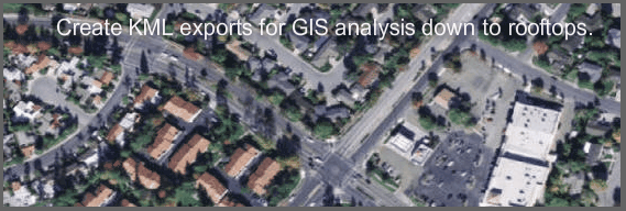
NFIRS 5 Alive creates KML files that have been developed and tested for use with Google Earth Pro. Google Earth Pro is the GIS browser version made for business purposes. It's low-cost subscription makes sophisticated GIS available to most fire departments. Using the Internet to view map pages may seem like a "light-weight" solution, but consider what KML files created by NFIRS 5 Alive and viewed on Google Earth can do.
Dynamically Defined Districts
If you enter lats / longs for the most NW point in your jurisdiction and the most SE point in your jurisdiction. NFIRS 5 Alive will create a grid of cells (any density you wish) over your jurisdiction. Each of these cells is a "Dynamically Defined District" or D3 District.
D3 Districts can lay flat over a map of your jurisdiction or they can be made into a 3D rectangle where the height of the rectangle indicates the relative number of incidents in district and the color indicates the performance being measured.
NFIRS 5 Alive tracks response statistics for each D3 District and creates the following map reports:
Grid over the area showing only D3 Districts with a pre-set minimum number of incidents
Colored D3 Districts showing distance from nearest fire station to the center of each D3 District.
"Weighted" distance from the nearest 3 fire stations to the center of each D3 District.
Incident Count by D3 District color-coded by number of incidents
Apparatus Responses by D3 District color-coded by number of responses
Staff Hours by color-coded D3 District
Dollar Loss by color-coded D3 District color coded by dollar loss
Median Travel Time Compliance by D3 District color-coded by compliance percentage
Median 1st Arriving Apparatus Response Time by D3 District color-coded by response time
First Due Apparatus Compliance by D3 District by compliance percentage
Travel Time Compliance before and after company brownouts
Mapping Icons
In addition to D3 Districts NFIRS 5 Alive compiles KML files that locates incidents by type. Examples of KML reports that place icons on incident locations include:
Incidents color-coded by incident type
Incidents color-coded by dollar loss
Incidents color-coded by travel time minute
Incidents color-coded by travel time compliance
Incidents color-coded by first arrival minute
Incidents color coded by first arrival compliance
Incidents by arrival of full-first arrival assignment compliance
Spiders
"Spiders" are lines draw from the originating station to the incident location. Spider lines may be color-coded by incident type, duration of response or compliance percentage.
Spider reports include:
Incidents color-coded by incident type
Incidents color-coded by travel time minute
Incidents color-coded by travel time compliance
Incidents color-coded by first arrival minute
Note: All icon and spider reports can be animated over a 24-hour period. When animated incident locations appear and disappear based on the alarm time and last unit clear time of the incident.
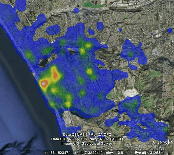
Heat Map Example
Heat maps display call densities by color. Here we see the highest call density in white. Higher call densities in red and yellow and lower call densities in blue.
The power of the heat map lies in record selection. You can view structure fires, vehicle accidents, incidents where the response time was greater than 8-minutes, etc. Heat mapping can be a great visual representation of any incident distribution you select.
The coordinates for the map below were exported from NFIRS 5 Alive and imported into Heat Map Studio (a product of slimApps) and displayed in Google Earth (a product of Google, Inc.).
The Geocoding Connection
If your fire department's CAD system geocodes incident locations you can import and merge geocoding data into NFIRS 5 Alive incidents. If your CAD system does not geocode records then NFIRS 5 Alive provides a geocoding interface that allows you to use web services to geocode your inventory of incidents.