Finally, press the Calculate Comparative Graph button. This will start a process to create three animated graphs illustrating the demand for responders over time.
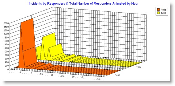
Here's an example graph:

The red 3D area graph illustrates the number of incidents (vertical axis) by the number of people required to handle the incidents (horizontal axis). The red shows responder demand without any simultaneous incidents. The yellow illustrates total responder demand. Any movement of the graph to the right and higher indicates increased responder demand. Notice how overall demand requires larger numbers of responders because of simultaneous incident activity.
Be sure to animate the graphs to illustrate staffing demand by hour of day, day of week and by month.